
31. Advanced
Pseudo-elements
Adds styles to a specific part of an element. It is represented with a double colon (::) after the selector.
after
After an element. Very much used together with the content property since it allows having an adjacent area.
.firma::after {
  content: " Francisco de Quevedo";
  font-style: italic;
}
<p class="firma">
Love is faith and not science.
</p>Love is faith and not science.
before
Before an element. Very much used together with the content property since it allows having an adjacent area.
.tarea::before {
  content: "[X] ";
}
<p class="tarea">
Learn Russian.
</p>Learn Russian.
first-letter
First letter of the content.
.elemento::first-letter {
  text-transform: uppercase;
  font-size: 3rem;
  font-weight: bold;
}
<p class="elemento">
in a village of La Mancha...
</p>in a village of La Mancha...
first-line
First line of the content.
.texto::first-line {
  background: yellow;
}
<p class="texto">
Lorem ipsum dolor sit amet, consectetur adipiscing elit, sed do eiusmod tempor incididunt ut labore et dolore magna aliqua. Ut enim ad minim veniam, quis nostrud exercitation ullamco laboris nisi ut aliquip ex ea commodo consequat. Duis aute irure dolor in reprehenderit in voluptate velit esse cillum dolore eu fugiat nulla pariatur. Excepteur sint occaecat cupidatat non proident, sunt in culpa qui officia deserunt mollit anim id est laborum.
</p>Lorem ipsum dolor sit amet, consectetur adipiscing elit, sed do eiusmod tempor incididunt ut labore et dolore magna aliqua. Ut enim ad minim veniam, quis nostrud exercitation ullamco laboris nisi ut aliquip ex ea commodo consequat. Duis aute irure dolor in reprehenderit in voluptate velit esse cillum dolore eu fugiat nulla pariatur. Excepteur sint occaecat cupidatat non proident, sunt in culpa qui officia deserunt mollit anim id est laborum.
file-selector-button
Button of a file-type input.
.input::file-selector-button {
  background: orange;
  color: white;
  border: 0;
}
<input name="avatar" type="file">
Pseudo-classes
Special states of a selector, such as :hover or :focus. It is represented with a colon (:) after the selector.
first-child
First element of a set of siblings.
li:first-child {
  color: orange;
}
<ul>
<li>Bread</li>
<li>Rice</li>
<li>Lentils</li>
<li>Chickpeas</li>
</ul>- Bread
- Rice
- Lentils
- Chickpeas
It only works when applied to sibling selectors, not on a parent (
ulin this case).
last-child
Last element of a set of siblings.
li:last-child {
  color: orange;
}
<ul>
<li>Bread</li>
<li>Rice</li>
<li>Lentils</li>
<li>Chickpeas</li>
</ul>- Bread
- Rice
- Lentils
- Chickpeas
nth-child
A specific element of a set of siblings. It starts counting at 1.
In case I want to give a style to the second one.
li:nth-child(2) {
  color: orange;
}
<ul>
<li>Bread</li>
<li>Rice</li>
<li>Lentils</li>
<li>Chickpeas</li>
</ul>- Bread
- Rice
- Lentils
- Chickpeas
:not
We are talking about a pseudo-class that, instead of selecting, excludes. That is, it selects everything except what is indicated.
.destacado {
  color: red;
}

p:not(.destacado) {
  color: orange;
}
<!-- This paragraph will be red -->
<p class="destacado">Lorem ipsum dolor sit amet, consectetur adipiscing elit, sed do eiusmod tempor incididunt ut labore et dolore magna aliqua.</p>
<!-- This paragraph will be orange -->
<p class="normal">Lorem ipsum dolor sit amet, consectetur adipiscing elit, sed do eiusmod tempor incididunt ut labore et dolore magna aliqua.</p>It is very useful for avoiding overriding selectors.
For example, in the following case I have a class for all my articles called .articulo. By default it will be hidden. To show it we will use the class .articulo--ver.
<article class="articulo articulo--ver">
  <p>Lorem ipsum dolor sit amet, consectetur adipiscing elit, sed do eiusmod tempor incididunt ut labore et dolore magna aliqua.</p>
</article>
We would usually use the cascade order to override the styles.
.articulo {
  display: none;
}

.articulo--ver {
  display: block;
}
But with :not we can avoid it.
.articulo:not(.articulo--ver) {
  display: none;
}
We avoid defining a default display, and only define the one we want to remove in case it does not have the class .articulo--ver.
Another example is when we play with :first-child or :last-child. In the following case, I want all the elements of a list to have a border at the bottom, except the last one.
li {
  border-bottom: 1px solid orange;
}

li:last-child {
  border-bottom: 0;
}
With :not we can summarize it as follows.
li:not(:last-child) {
  border-bottom: 1px solid orange;
}
The :not selector is very powerful, but you have to be careful with its global use. It is not advisable to use it on general parent selectors, such as body:not(.home). In this case, the browser has to traverse the whole DOM to know whether the body has the class .home or not. Always for specific selectors.
Techniques to center, or focus, attention
When a popup modal is shown, we have to redirect where the visitor looks and eliminate any kind of distraction. For this we can use a couple of techniques.
@supports
There are many styles that, unfortunately, are not compatible with all browsers. This limits us from being able to use advanced features. The @supports declaration gives us a partial solution, since it lets us ask whether a certain style is compatible before using it, and if not, it offers us the possibility of providing an alternative.
A typical case. I want to know whether I can use lch, an expression of a color in LCH. For now, it is only compatible with Safari. I will use the color lch(30% 45 27) for my a, and in case it is not possible I will look for an approximation in rgb.
a {
    /* Compatible with all browsers */
    color: rgb(50.24% 14.25% 16.34%);
}

/* Compatible with Safari */
@supports (color: lch(30% 45 27)) {
    a {
        color: lch(30% 45 27);
    }
}
Another, more advanced typical case. I want to use backdrop-filter, which adds a blur to the parent to focus attention. It is only compatible in Chrome, as I write these lines, and in Safari with the webkit prefix.
.modal {
    /* Modal styles */
}

/* Is it compatible with Chrome? */
@supports (backdrop-filter: blur(8px)) {
    .modal {
        backdrop-filter: blur(8px);
    }
}

/* Is it compatible with Safari? */
@supports (-webkit-backdrop-filter: blur(8px)) {
    .modal {
        -webkit-backdrop-filter: blur(8px);
    }
}

/* Is it not compatible? For example Firefox */
@supports (not (backdrop-filter: blur(8px))) and (not (-webkit-backdrop-filter: blur(8px))) {
    .modal {
        background-color: #fff5;
    }
}This work is under a Attribution-NonCommercial-NoDerivatives 4.0 International license.
:quality(85)/https://andros.dev/static/img/components/license/by-nc-nd.png)
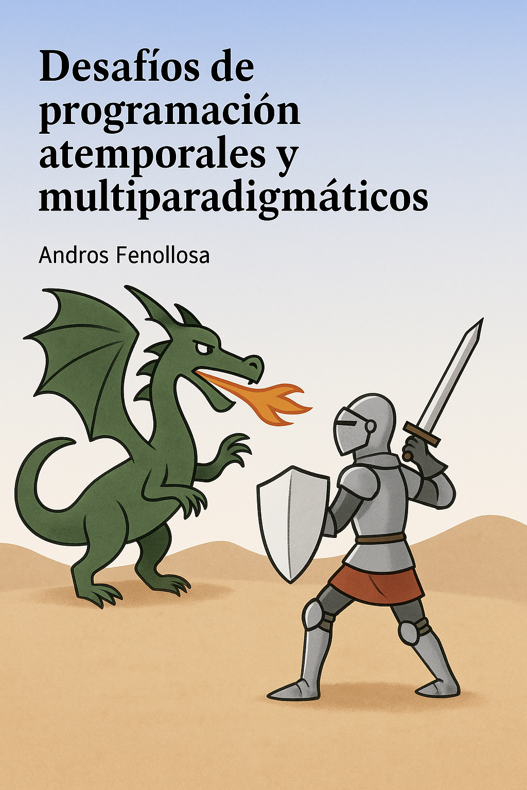
Desafíos de programación atemporales y multiparadigmáticos
Te encuentras ante un librillo de actividades, divididas en 2 niveles de dificultad. Te enfrentarás a los casos más comunes que te puedes encontrar en pruebas técnicas o aprender conceptos elementales de programación.
Buy the book Sure, it's on me!
Comments
There are no comments yet.