
9. Text
font-size
Text size. Throughout the examples the rem unit of measurement will be used. In the next lesson its origin and reference are explained; for now it is only important that you use it knowing that 1rem is equivalent to your browser's font size (in the vast majority, 16px).
.texto {
    font-size: 2.5rem;
}
font-style
Font style.
.texto {
    font-style: normal;
    font-style: italic;
    font-style: oblique;
    font-style: oblique 20deg;
}
font-variant
Small caps.
.texto {
    font-variant: normal;
    font-variant: small-caps;
}
font-weight
Font weight.
.texto {
    font-weight: normal;
    font-weight: bold;

    /* Relative to the parent */
    font-weight: lighter;
    font-weight: bolder;

    /* Numeric weight */
    font-weight: 100; /* Thin */
    font-weight: 200;
    font-weight: 300; /* Light */
    font-weight: 400; /* Regular */
    font-weight: 500;
    font-weight: 600;
    font-weight: 700; /* Bold */
    font-weight: 800;
    font-weight: 900; /* Black */
}
text-transform
Capitalization, uppercase and lowercase.
.texto {
    text-transform: none;
    text-transform: capitalize;
    text-transform: uppercase;
    text-transform: lowercase;
}
text-align
Text alignment.
.texto {
    text-align: start;
    text-align: end;
    text-align: left;
    text-align: right;
    text-align: center;
    text-align: justify;
    /* Experimental: Same as justify except it forces the last line */
    text-align: justify-all;
}
word-spacing
Distance between words.
.texto {
    word-spacing: 1.2rem;
}
letter-spacing
Space between letters.
.texto {
    letter-spacing: 1.2rem;
}
text-decoration
Underline, overline, or strikethrough.
.texto {
    /* Underline */
    text-decoration: underline;
    /* Overline, and also red in color */
    text-decoration: overline red;
    /* Strikethrough */
    text-decoration: line-through;
    /* Remove underline */
    text-decoration: none;
}
hover
Pseudo-class that is activated when the user leaves the cursor over the element.
/* Default styles */
.estilo {
    color: orange;
}

/* Styles when the cursor is over it */
.estilo:hover {
    color: blue;
}
font-family
Select font.
.estilo {
    /* Font name + generic name:
    If it doesn't find the first one installed, it looks for the generic one */
    font-family: "Oswald", sans-serif;
    font-family: "Poppins", sans-serif;

    /* Most used generic names */
    font-family: serif;
    font-family: sans-serif;
    font-family: monospace;
}
font-face
Load font.
@font-face {
    /* Alias you give it to use it */
    font-family: "Fira Sans";
    /* Source */
    src: url("../fonts/OpenSans-Regular-webfont.woff2") format("woff2");
    /* Does not block the loading of the text. When the typography is downloaded it will be applied */
    font-display: swap;
}

body {
    /* You use it */
    font-family: "Fira Sans";
}
The most widespread formats, in order of recommendation, are:
- woff2
- woff
- otf
- ttf
font-display
Loading behavior.
.texto {
    /* Does not show the text until the typography is loaded */
    font-display: block;
    /* It does show the text. When the typography is loaded it will change */
    font-display: swap;
}
Activity 1
Starting from the prologue of Moby Dick, create a website using the following styles in its design.
font-sizefont-stylefont-weight
Use the following text.
Moby Dick

Herman Melville

Prologue

We live in times when men can harpoon whales with impunity. In spite of all the ecologists in the world, they locate them by means of radar, sometimes even secure the complicity of a seaplane, and then, to kill the enormous mammal that surfaces in the distance, all they need is to pull the trigger from the deck of the killer ship. Their hand doesn't even tremble.

There were other eras, however, in which they did not have it so easy. Sailors embarked back then in uncomfortable sailing ships, hastily lowered the boats, rowed tirelessly toward where the whale was, and, when they had it within range, threw the cruel harpoons and trusted in their good luck.
Activity 2
Let's improve the previous activity
- Space out the letters of the title: Moby Dick.
- Space out the author's first name and last name a little.
- Turn the chapter title, Prologue, into uppercase.
- Justify the chapter's text.
Activity 3
We are as stubborn as Captain Ahab, we don't give up on Moby Dick.
Carry out the following tasks.
- When my cursor is placed over the title, it must change its style to italic and change its color to blue.
- The chapter title must turn bold and red.
Activity 4
Let's set aside, for now, our marine struggle and focus on creating a new site with whatever text you want.
The steps to follow are:
- Download 2 different typographies, one for the title and another for the text.
- Load both fonts in the CSS with
@font-face. - Create a couple of classes for each font and apply them on the HTML where appropriate.
Activity 5
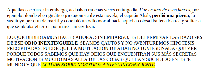
Starting from the following text...
Those hunts, however, often ended in tragedy. It was in one of those episodes, for example, that the enigmatic protagonist of this novel, Captain Ahab, lost a leg, replaced it with another one made of ivory, and conceived a mortal hatred toward that colossal white and solitary whale that spread terror across uncivilized seas.

What we should do now, however, is determine the reasons for that inextinguishable hatred. Let us be cautious and not venture hasty hypotheses. It may be that Ahab's mutilation had nothing to do with it, because we all know that there are hatreds that find their most secret motivations far beyond the things that have happened in this world and that act upon us at an unconscious level.
Achieve the following website.
This work is under a Attribution-NonCommercial-NoDerivatives 4.0 International license.
:quality(85)/https://andros.dev/static/img/components/license/by-nc-nd.png)
Desafíos de programación atemporales y multiparadigmáticos
Te encuentras ante un librillo de actividades, divididas en 2 niveles de dificultad. Te enfrentarás a los casos más comunes que te puedes encontrar en pruebas técnicas o aprender conceptos elementales de programación.
Buy the book Sure, it's on me!
Comments
There are no comments yet.