
23. Animation
Below you can see a basic animation with the minimum styles for it to work.
/* Animation definition */
@keyframes animacion-rotacion {
  from {
    transform: rotate(0deg);
  }

  to {
    transform: rotate(90deg);
  }
}

.cuadrado {
  width: 10rem;
  height: 10rem;
  background: orange;
  /* Animation declaration */
  animation-name: animacion-rotacion;
  animation-duration: 1s;
  animation-timing-function: linear;
  animation-iteration-count: infinite;
}
It must always be composed of keyframes (animation definition) and its styles (configuration).
@keyframes
It lets us define the steps of an animation where we indicate each step with a percentage relative to the final duration.
@keyframes [name] {

  [initial step] {

  }

  [final step] {

  }

}
The simplest structure is using the aliases from (0%) and to (100%).
@keyframes animacion-transicion-color {

  from {
    color: red;
  }

  to {

    color: yellow;
  }

}
Which is equivalent to:
@keyframes animacion-transicion-color {

  0% {
    color: red;
  }

  100% {
    color: yellow;
  }

}
If we want to add more steps, we just add more elements.
@keyframes animacion-caida-pelota {

  0% {
    top: 0;
  }

  50% {
    top: 100px;
  }

  100% {
    transform: scaleY(0.5);
  }

}
@keyframes animacion-vibracion {
0% {
top: 0;
}
5% {
top: -100px;
}
10% {
top: 100px;
}
100% {
top: 0;
}
}animation-name
Name of the keyframe to associate with the element.
.elemento {
  animation-name: animacion-rotacion;
}animation-duration
Time the animation will last.
.elemento {
  animation-duration: 2s;
}animation-timing-function
Function that defines the curve of the animation.
.elemento {
  /* Default */
  animation-timing-function: ease;

  /* Other preset functions */
  animation-timing-function: ease-in;
  animation-timing-function: ease-out;
  animation-timing-function: ease-in-out;
  animation-timing-function: linear;

  /* Custom */
  animation-timing-function: cubic-bezier(0.1, 0.7, 1.0, 0.1);
}animation-delay
Delay in starting.
.elemento {
  animation-delay: 1s;
}animation-iteration-count
Number of times it will repeat.
.elemento {
  animation-iteration-count: 1;
  animation-iteration-count: infinite;
}animation-direction
Direction in which the animation will run: normal, reverse, or alternating.
.elemento {
  /* Default, it plays in one direction */
  animation-direction: normal;
  /* It plays in reverse direction */
  animation-direction: reverse;
  /* It plays in normal direction and plays again in reverse direction */
  animation-direction: alternate;
  /* It plays in reverse direction and plays again in normal direction */
  animation-direction: alternate-reverse;
}animation-fill-mode
We can control which styles remain once the animation has finished.
.elemento {
  /* Default, the styles go back to the state prior to the animation */
  animation-fill-mode: none;
  /* When the animation ends it keeps the final styles */
  animation-fill-mode: forwards;
}animation-play-state
We can indicate whether the animation should play or pause.
.elemento {
  /* Play */
  animation-play-state: running;
  /* Pause */
  animation-play-state: paused;
}This work is under a Attribution-NonCommercial-NoDerivatives 4.0 International license.
:quality(85)/https://andros.dev/static/img/components/license/by-nc-nd.png)
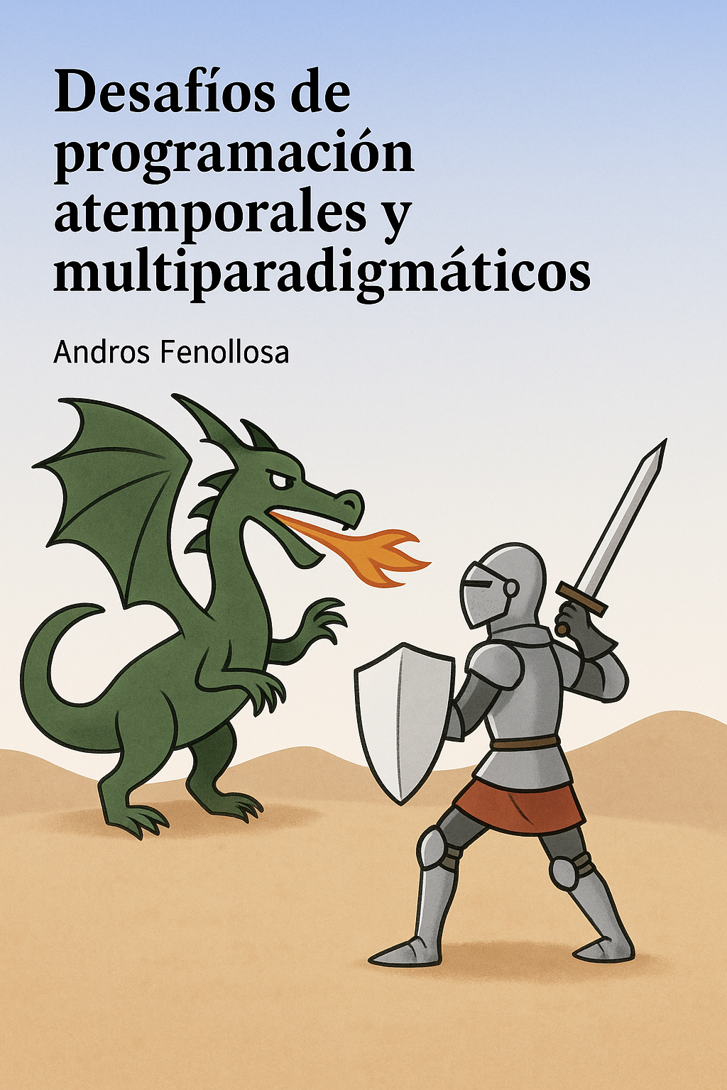
Desafíos de programación atemporales y multiparadigmáticos
Te encuentras ante un librillo de actividades, divididas en 2 niveles de dificultad. Te enfrentarás a los casos más comunes que te puedes encontrar en pruebas técnicas o aprender conceptos elementales de programación.
Buy the book Sure, it's on me!
Comments
There are no comments yet.