
5. Grid
Grid is one of the most important additions to CSS when it comes to layout. It lets us create complex structures easily and without having to alter the HTML. In other words, we can build grids to place elements almost anywhere without touching the HTML structure.
Before diving into the styles, we need to understand how you lay things out with Grid. To do that, I'm going to show you a complete example so you can grasp its potential, and then I'll explain each layer individually. Don't panic!
Let's imagine, for the example we are NOT going to understand yet, that our website is a chessboard.
:quality(85)/https://andros.dev/static/img/courses/css/23/tablero1.jpg)
I could mark out how I want to arrange the structure of my elements.
:quality(85)/https://andros.dev/static/img/courses/css/23/tablero2.jpg)
Now I implement it in HTML/CSS using Grid.
<html>
    <head>
        <!-- CSS -->
        <style>
            .tablero {
                display: grid;
                grid-template-columns: 300px 500px;
                grid-template-rows: 200px 100px 500px;
                width: 800px;
                height: 800px;
            }
            .azul {
                background-color: blue;
                grid-column: 2 / 3;
                grid-row: 2 / 3;
            }
            .amarillo {
                background-color: yellow;
                grid-column: 1 / 2;
                grid-row: 1 / 4;
            }
            .rojo {
                background-color: red;
                grid-column: 2 / 3;
                grid-row: 1 / 2;
            }
            .verde {
                background-color: green;
                grid-column: 2 / 3;
                grid-row: 3 / 4;
            }
        </style>
    </head>
    <body>
        <!-- HTML -->
        <div class="tablero">
            <div class="azul"></div>
            <div class="amarillo"></div>
            <div class="rojo"></div>
            <div class="verde"></div>
        </div>
    </body>
</html>
The result would be practically identical:
:quality(85)/https://andros.dev/static/img/courses/css/23/resultado.jpg)
Simple, right? Even if you don't know what happened here, I want you to keep in mind that Grid lets us create complex structures easily. And that there is no need to alter the HTML.
Now let's explain each element.
Basic concepts
To start, we need to be clear that there are two clearly distinct parts: a parent and its children. The parent will be the board or the tag that wraps everything. It will carry the display: grid style. And the children are the containers or elements we want to position inside our board. If you've worked with flex, you'll notice that it works exactly the same way.
An example.
<html>
    <head>
        <!-- CSS -->
        <style>
            .tablero {
                display: grid;
                width: 800px;
                height: 800px;
            }
            .azul {
                background-color: blue;
            }
            .amarillo {
                background-color: yellow;
            }
            .rojo {
                background-color: red;
            }
            .verde {
                background-color: green;
            }
        </style>
    </head>
    <body>
        <!-- HTML -->
        <div class="tablero">
            <div class="azul"></div>
            <div class="amarillo"></div>
            <div class="rojo"></div>
            <div class="verde"></div>
        </div>
    </body>
</html>:quality(85)/https://andros.dev/static/img/courses/css/23/hello_grid1.jpg)
Alright, maybe you feel disappointed. Patience! We still have to tell each child where it should be placed :)
The parent is going to define how many rows and columns our board will have. It will even say how big each one will be.
Say I wanted a 2x2 structure. Or, put another way, starting from the fact that our board measures 800px by 800px: 2 columns of 400px and 2 rows of 400px.
<html>
    <head>
        <!-- CSS -->
        <style>
            .tablero {
                display: grid;
                /* Columns */
                grid-template-columns: 400px 400px;
                /* Rows */
                grid-template-rows: 400px 400px;
                width: 800px;
                height: 800px;
            }
            .azul {
                background-color: blue;
            }
            .amarillo {
                background-color: yellow;
            }
            .rojo {
                background-color: red;
            }
            .verde {
                background-color: green;
            }
        </style>
    </head>
    <body>
        <!-- HTML -->
        <div class="tablero">
            <div class="azul"></div>
            <div class="amarillo"></div>
            <div class="rojo"></div>
            <div class="verde"></div>
        </div>
    </body>
</html>:quality(85)/https://andros.dev/static/img/courses/css/23/hello_grid2.jpg)
Simple, isn't it?
Of course, I can change the sizes.
<html>
    <head>
        <!-- CSS -->
        <style>
            .tablero {
                display: grid;
                /* Columns */
                grid-template-columns: 100px 700px;
                /* Rows */
                grid-template-rows: 500px 300px;
                width: 800px;
                height: 800px;
            }
            .azul {
                background-color: blue;
            }
            .amarillo {
                background-color: yellow;
            }
            .rojo {
                background-color: red;
            }
            .verde {
                background-color: green;
            }
        </style>
    </head>
    <body>
        <!-- HTML -->
        <div class="tablero">
            <div class="azul"></div>
            <div class="amarillo"></div>
            <div class="rojo"></div>
            <div class="verde"></div>
        </div>
    </body>
</html>:quality(85)/https://andros.dev/static/img/courses/css/23/hello_grid3.jpg)
Positioning the children
This time we're going to place each child wherever we want. We start from a 3x3 board.
:quality(85)/https://andros.dev/static/img/courses/css/23/tablero3.jpg)
Our end goal will be to place 5 elements in this structure.
:quality(85)/https://andros.dev/static/img/courses/css/23/tablero4.jpg)
Let's prepare our code.
<html>
    <head>
        <!-- CSS -->
        <style>
            .tablero {
                display: grid;
                grid-template-columns: 300px 300px 300px;
                grid-template-rows: 300px 300px 300px;
                width: 900px;
                height: 900px;
            }
            .azul {
                background-color: blue;
            }
            .amarillo {
                background-color: yellow;
            }
            .rojo {
                background-color: red;
            }
            .verde {
                background-color: green;
            }
            .rosa {
                background-color: pink;
            }
        </style>
    </head>
    <body>
        <!-- HTML -->
        <div class="tablero">
            <div class="azul"></div>
            <div class="amarillo"></div>
            <div class="rojo"></div>
            <div class="verde"></div>
            <div class="rosa"></div>
        </div>
    </body>
</html>:quality(85)/https://andros.dev/static/img/courses/css/23/resultado2.jpg)
Each child must be positioned by a start and an end for its column and row. Our board has the following lines.
:quality(85)/https://andros.dev/static/img/courses/css/23/tablero5.jpg)
Let's start with the yellow child. It occupies the area between column 1 and column 2.
.amarillo {
    background-color: yellow;
    grid-column-start: 1;
    grid-column-end: 2;
}
And from row 1 to row 4.
.amarillo {
    background-color: yellow;
    grid-column-start: 1;
    grid-column-end: 2;
    grid-row-start: 1;
    grid-row-end: 4;
}:quality(85)/https://andros.dev/static/img/courses/css/23/resultado3.jpg)
A shorthand version of the above.
.amarillo {
    background-color: yellow;
    grid-column: 1 / 2;
    grid-row: 1 / 4;
}
Applying the same technique, the example would end up looking like this.
<html>
    <head>
        <!-- CSS -->
        <style>
            .tablero {
                display: grid;
                grid-template-columns: 300px 300px 300px;
                grid-template-rows: 300px 300px 300px;
                width: 900px;
                height: 900px;
            }
            .azul {
                background-color: blue;
                grid-column: 2 / 4;
                grid-row: 3 / 4;
            }
            .amarillo {
                background-color: yellow;
                grid-column: 1 / 2;
                grid-row: 1 / 4;
            }
            .rojo {
                background-color: red;
                grid-column: 2 / 3;
                grid-row: 1 / 3;
            }
            .verde {
                background-color: green;
                grid-column: 3 / 4;
                grid-row: 1 / 2;
            }
            .rosa {
                background-color: pink;
                grid-column: 3 / 4;
                grid-row: 2 / 3;
            }
        </style>
    </head>
    <body>
        <!-- HTML -->
        <div class="tablero">
            <div class="azul"></div>
            <div class="amarillo"></div>
            <div class="rojo"></div>
            <div class="verde"></div>
            <div class="rosa"></div>
        </div>
    </body>
</html>:quality(85)/https://andros.dev/static/img/courses/css/23/resultado4.jpg)
grid-template-columns
Defines the number of columns and their size.
Fixed
.cuadricula {
  display: grid;
  grid-template-columns: 10rem 10rem;
}
Fractions
Distributes the available space.
.cuadricula {
  display: grid;
  /* 50% and 50% */
  grid-template-columns: 1fr 1fr;
  /* 75% and 25% */
  grid-template-columns: 3fr 1fr;
  /* all the available space + 10rem */
  grid-template-columns: 1fr 10rem;
}
Minimum and maximum
Defines a minimum and maximum size.
.cuadricula {
  display: grid;
  /* Between 20rem and 30rem */
  grid-template-columns: minmax(20rem, 30rem);
  /* Between 20rem and 100% */
  grid-template-columns: minmax(20rem, 1fr);
}
Repeat
Repeats a size a number of times.
.cuadricula {
  display: grid;
  grid-template-columns: repeat(3, 10rem);
}
grid-row-start/grid-row-end/grid-row
Defines which row it will start and end on within the grid.
.elemento {
  grid-row-start: 1;
  grid-row-end: 2;
}
A shorthand form is using grid-row.
.elemento {
  grid-row: 1 / 2;
}
grid-column-start/grid-column-end
Defines which column it will start and end on within the grid.
.elemento {
  grid-column-start: 1;
  grid-column-end: 2;
}
A shorthand form is using grid-column.
.elemento {
  grid-column: 1 / 2;
}
grid-row-gap
Adds space between the rows.
.cuadricula {
  grid-row-gap: 2rem;
}
grid-column-gap
Adds space between the columns.
.cuadricula {
  grid-column-gap: 2rem;
}
gap
Adds space between the columns and the rows. We already used it with Flex.
.cuadricula {
  gap: 2rem;
}
grid-template-rows
Defines the number of rows and their size. It shares the same sizing units as grid-template-columns.
.cuadricula {
  display: grid;
  grid-template-rows: 1fr 1fr;
}
grid-auto-flow
Automatically positions the elements in the spaces they can fit into, following their order or not.
Horizontal order
.cuadricula {
    display: grid;
    grid-auto-flow: row;
    grid-template-columns: repeat(3, 1fr);
    grid-template-rows: repeat(3, 10rem);
    gap: 1rem;
}

.elemento {
    border: 5px solid #d66853;
    background-color: #f7b143;
    color: white;
    font-size: 3rem;
    display: flex;
    justify-content: center;
    align-items: center;
}

.elemento-ancho {
    grid-column: auto / span 2;
}
<section class="cuadricula">
<article class="elemento">1</article>
<article class="elemento">2</article>
<article class="elemento elemento-ancho">3</article>
<article class="elemento">4</article>
<article class="elemento">5</article>
<article class="elemento elemento-ancho">6</article>
</section>Vertical order
.cuadricula {
    display: grid;
    grid-auto-flow: column;
    grid-template-columns: repeat(3, 1fr);
    grid-template-rows: repeat(3, 10rem);
    gap: 1rem;
}

.elemento {
    border: 5px solid #d66853;
    background-color: #f7b143;
    color: white;
    font-size: 3rem;
    display: flex;
    justify-content: center;
    align-items: center;
}

.elemento-ancho {
    grid-column: auto / span 2;
}
<section class="cuadricula">
<article class="elemento">1</article>
<article class="elemento">2</article>
<article class="elemento elemento-ancho">3</article>
<article class="elemento">4</article>
<article class="elemento">5</article>
<article class="elemento elemento-ancho">6</article>
</section>No order, favoring packing
.cuadricula {
    display: grid;
    grid-auto-flow: row dense;
    grid-template-columns: repeat(3, 1fr);
    grid-template-rows: repeat(3, 10rem);
    gap: 1rem;
}

.elemento {
    border: 5px solid #d66853;
    background-color: #f7b143;
    color: white;
    font-size: 3rem;
    display: flex;
    justify-content: center;
    align-items: center;
}

.elemento-ancho {
    grid-column: auto / span 2;
}
<section class="cuadricula">
<article class="elemento">1</article>
<article class="elemento">2</article>
<article class="elemento elemento-ancho">3</article>
<article class="elemento">4</article>
<article class="elemento">5</article>
<article class="elemento elemento-ancho">6</article>
</section>Naming the areas
Marking out the position of each element in the grid with edges, or cuts, ends up being confusing as well as hard to maintain. For that, Grid lets us define the name of each area and assign an element to it.
We're going to repeat the example from the explanation, but this time defining the names of the areas.
The first step is to define its rows and columns.
.cuadricula {
    display: grid;
    grid-template-columns: repeat(3, 1fr);
    grid-template-rows: repeat(3, 1fr);
    width: 900px;
    height: 900px;
}
Nothing has changed yet. Now we're going to give an alias to each zone, and for that we'll use the grid-template-areas property.
.cuadricula {
    display: grid;
    grid-template-columns: repeat(3, 1fr);
    grid-template-rows: repeat(3, 1fr);
    width: 900px;
    height: 900px;
    grid-template-areas:
        "amarillo rojo verde"
        "amarillo rojo rosa"
        "amarillo azul azul";
}
The area names are defined inside quotes, and each row is separated by a line break. In this case, we've defined three rows and three columns, so we have nine areas but with whatever names we want.
Now, to assign an element to a zone, we'll use the grid-area property and give it the name of the zone.
.amarillo {
    grid-area: amarillo;
}

.rojo {
    grid-area: rojo;
}

.verde {
    grid-area: verde;
}

.rosa {
    grid-area: rosa;
}

.azul {
    grid-area: azul;
}
The HTML wouldn't change.
<section class="cuadricula">
    <article class="amarillo"></article>
    <article class="rojo"></article>
    <article class="verde"></article>
    <article class="rosa"></article>
    <article class="azul"></article>
</section>
Final notes
It's curious, because for simple one-directional designs Flex is more than enough, while Grid becomes tedious. Whereas with complex structures the tables turn: Flex gets messy while Grid becomes a sharp tool for managing all kinds of spaces. Experience will teach you the hard way when to use each one, but don't forget my earlier advice. You can't marry either of them; both exist to solve different problems.
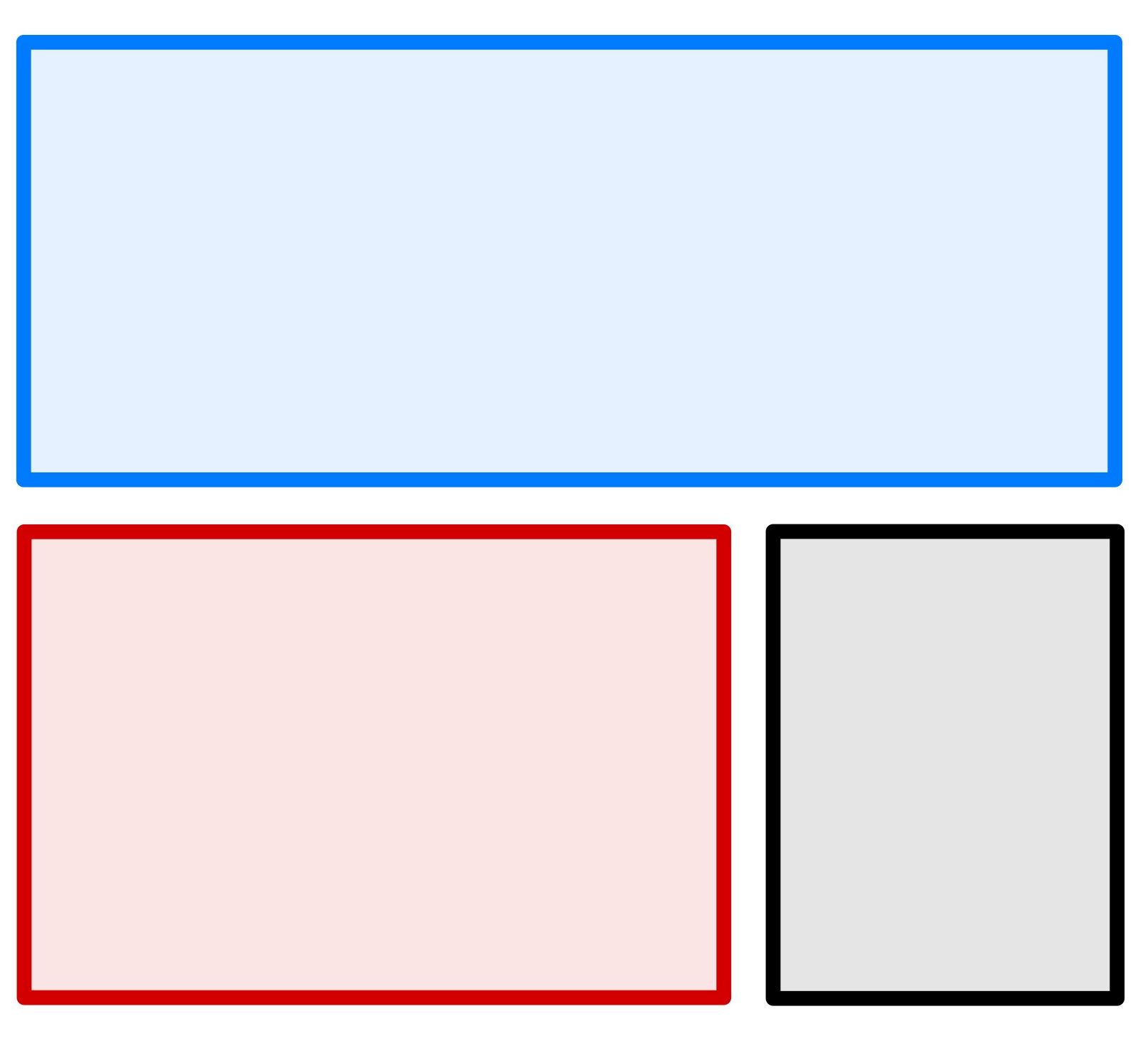
Activity 1
Using the following image, build the layout with Grid.
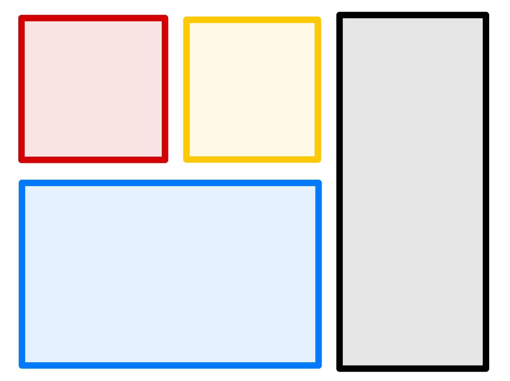
Activity 2
Using the following image, build the layout with Grid.
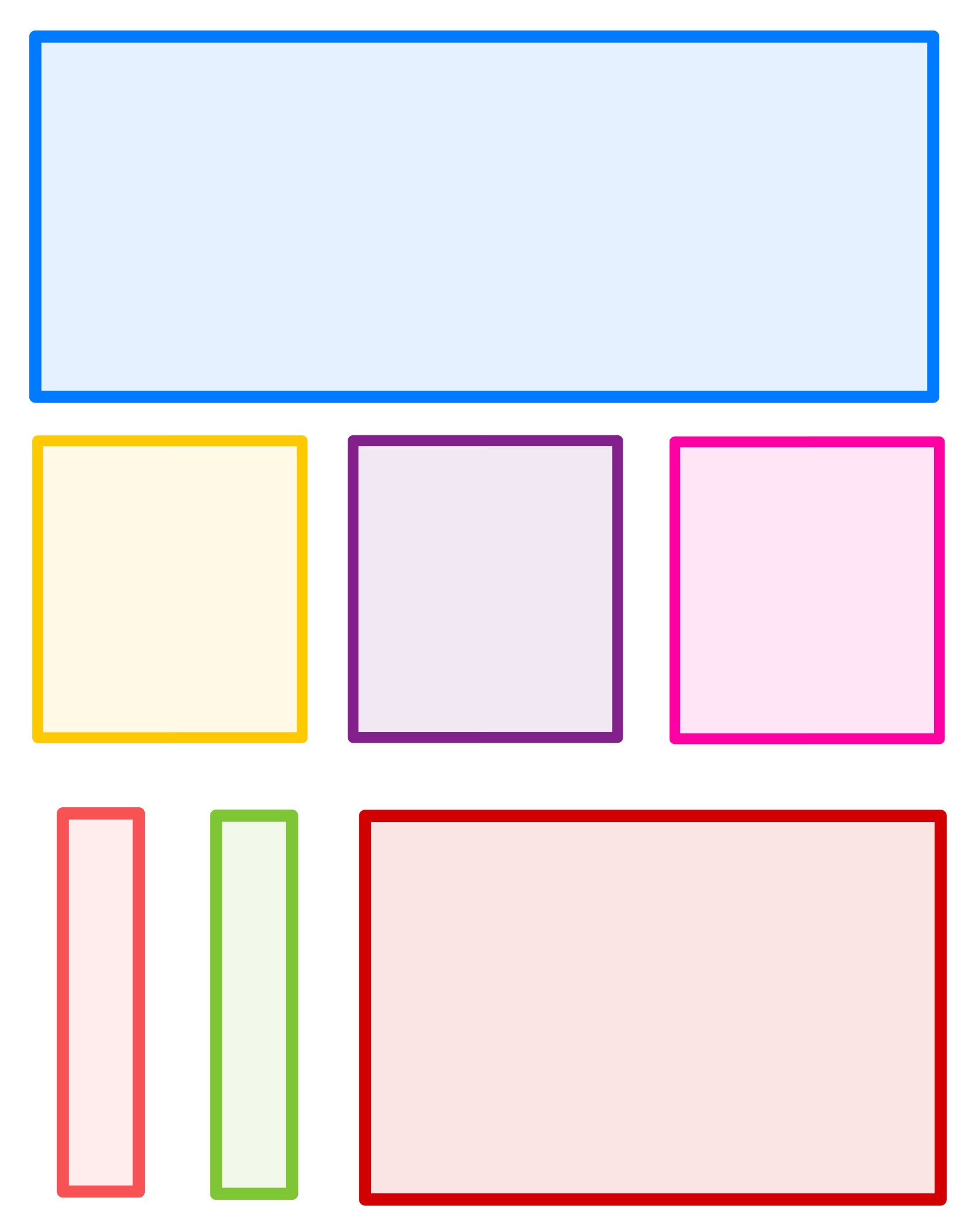
Activity 3
Using the following image, build the layout with Grid.
Activity 4
Using the following image, build the layout with Grid.
Activity 5
Using the following image, build the layout with Grid targeting smartphones (less than 500px wide).
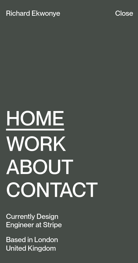
Activity 6
Using the following image, build the layout with Grid.
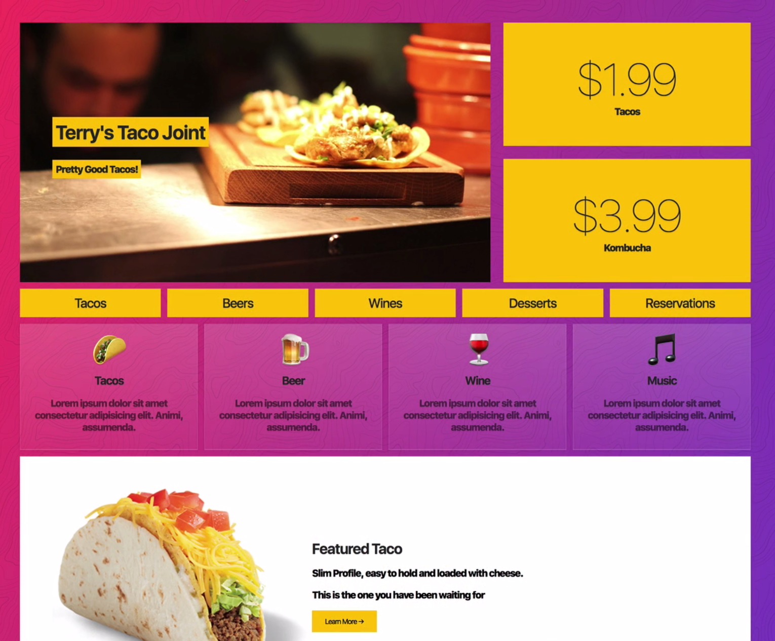
Activity 7
Using the following image, build the layout with Grid.

:quality(85)/https://andros.dev/static/img/components/license/by-nc-nd.png)
This work is under a Attribution-NonCommercial-NoDerivatives 4.0 International license.

Building SPAs with Django and HTML Over the Wire: Learn to build real-time single page applications with Python
The HTML over WebSockets approach simplifies single-page application (SPA) development and lets you bypass learning a JavaScript rendering framework such as React, Vue, or Angular, moving the logic to Python. This web application development book provides you with all the Django tools you need to simplify your developments with real-time results.
Buy the bookHelp me keep writing
Every coffee gives me a push toward the next article.
 Sure, it's on me!
Comments
There are no comments yet.