

1. Introduction
I assume you already know the whole markup system, and if not I recommend visiting my HTML course, and that you know how to apply styles (otherwise review my CSS course without skipping the Sass lesson). Without both foundations you won't be able to follow this course. If you already know them, let's go!
Web layout is the part of web development in charge of giving shape to the web page. That is, of defining the structure of the page, and of positioning the elements on it. To do this we use different modern techniques that we will need to learn.
In this course you will learn how to lay out a web page with responsive design using HTML and CSS. You will learn to position the elements on the page and make it adapt to any device. Additionally, I will teach you how to organize your code so that it is easy to maintain or work on as a team.
Are you ready? Let's begin!
Reset zoom
By default, a browser will apply a zoom in mobile/cellphone versions (from now on I will call it smartphone) to adjust the size of the text; which will ruin a design. The solution is to tell the browser with the viewport meta not to adjust the scaling and to start with the default scaling.
To do this we will add the following meta in the <head> of our page.
<meta name="viewport" content="width=device-width, initial-scale=1.0, shrink-to-fit=no">Images
It is recommended that all our images have a width of 100% so that they are adaptable to the design. But how will we set the image size? Through the width of its container. In addition, we will also set object-fit: cover and object-position: center to prevent them from being deformed when we specify measurements that break their aspect ratio (their width and height are not proportional).
We will always add the following CSS rule.
img {
  display: block;
  width: 100%;
  object-fit: cover;
  object-position: center;
}
display: blockso that it behaves as a block element, and thus be able to define its width and height.width: 100%so that it takes up 100% of its container.object-fit: coverso that it crops the image so it does not appear deformed.object-position: centerso that the image is centered within the crop.
In the following example the height has been set to 20rem to show how it would adapt to different containers.

Reset a list for navigation
To use a list as a navigation menu, remove the default styles.
Starting from a classic HTML structure for creating navigation menus:
<nav class="nav">
  <ul class="nav__list">
    <li class="nav__item">
      <a href="#" class="link">Item 1</a>
    </li>
    <li class="nav__item">
      <a href="#" class="link">Item 2</a>
    </li>
    <li class="nav__item">
      <a href="#" class="link">Item 3</a>
    </li>
  </ul>
</nav>
We will apply the following styles to .nav__list, our unordered list.
.nav__list {
  display: flex;
  flex-wrap: wrap;
  list-style: none;
  padding: 0;
}
We will go from a classic vertical list:
- Item 1
- Item 2
- Item 3
To a horizontal list with Flex:
The rest of the design is up to you.
Reset links
To remove the default styles from links, we will apply the following styles to .link:
.link {
  display: inline-block;
  color: inherit;
  text-decoration: none;
}
display: inline-blockso that it behaves as an inline element, but its width and height or margins can be defined.color: inheritso that it inherits the text color.text-decoration: noneto remove the underline.
When you group many hyperlinks together, leave a space between them to make tapping easier on smartphones. For example, if you have a list of hyperlinks like a navigation bar, Google recommends 48px between each one.
With all the basic styles ready, we can now start laying out our responsive web page. Let's begin!
:quality(85)/https://andros.dev/static/img/components/license/by-nc-nd.png)
This work is under a Attribution-NonCommercial-NoDerivatives 4.0 International license.
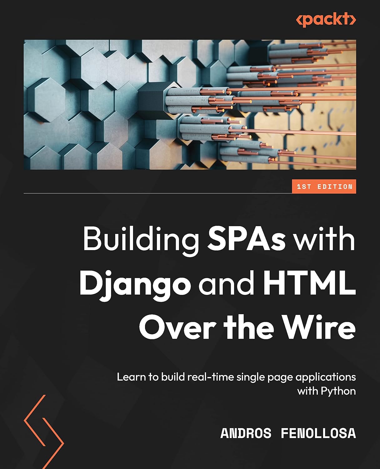
Building SPAs with Django and HTML Over the Wire: Learn to build real-time single page applications with Python
The HTML over WebSockets approach simplifies single-page application (SPA) development and lets you bypass learning a JavaScript rendering framework such as React, Vue, or Angular, moving the logic to Python. This web application development book provides you with all the Django tools you need to simplify your developments with real-time results.
Buy the bookHelp me keep writing
Every coffee gives me a push toward the next article.
 Sure, it's on me!
Comments
There are no comments yet.