
4. Flex
When laying out, we have a very powerful tool called Flex, or flexible boxes. We will control a group of elements in one dimension: vertical or horizontal. We can control the size of the elements, the space between them, the order, etc.
We must keep in mind that the elements we want to control must be inside a container. This container will be the one that has the display: flex property.
.grupo-de-elementos {
  display: flex;
}
By default the elements will be placed in a single line, from left to right. If the container is smaller than the elements, they will shrink to fit in the container.
<section class="grupo-de-elementos">
  <article>♠</article>
  <article>♥</article>
  <article>♣</article>
  <article>♦</article>
</section>
Without using flex, the elements would be placed one below the other.
But by applying flex, the elements will be placed in a single line.
Now let's look at the most important properties and how we can customize the behavior of the elements in a responsive design.
flex-direction
You define the direction of the elements.
From left to right
.grupo-de-elementos {
  display: flex;
  flex-direction: row;
}From right to left
.grupo-de-elementos {
  display: flex;
  flex-direction: row-reverse;
}From top to bottom
.grupo-de-elementos {
  display: flex;
  flex-direction: column;
}From bottom to top
.grupo-de-elementos {
  display: flex;
  flex-direction: column-reverse;
}flex-wrap
Forces the elements to stay on a single line or several.
nowrap
One line.
.grupo-de-elementos {
  display: flex;
  flex-wrap: nowrap;
}wrap
Several lines.
.grupo-de-elementos {
  display: flex;
  flex-wrap: wrap;
}wrap-reverse
Several lines in reverse order.
.grupo-de-elementos {
  display: flex;
  flex-wrap: wrap-reverse;
}justify-content
Manages the alignment on the axis.
Align to the center
.grupo-de-elementos {
  display: flex;
  justify-content: center;
}Align to the start
.grupo-de-elementos {
  display: flex;
  justify-content: flex-start;
}Align to the end
.grupo-de-elementos {
  display: flex;
  justify-content: flex-end;
}space-between
The first and last element stick to the sides, the rest of the space is distributed
.grupo-de-elementos {
  display: flex;
  justify-content: space-between;
}space-around
Uses the same space around each element
.grupo-de-elementos {
  display: flex;
  justify-content: space-around;
}space-evenly
The space is distributed uniformly across each element.
.grupo-de-elementos {
  display: flex;
  justify-content: space-evenly;
}align-items
Manages the alignment on the opposite axis.
Align to the center
.grupo-de-elementos {
  display: flex;
  align-items: center;
}Align to the start
.grupo-de-elementos {
  display: flex;
  align-items: flex-start;
}Align to the end
.grupo-de-elementos {
  display: flex;
  align-items: flex-end;
}There is a type of alignment for irregular heights called
baselinethat adjusts the baseline. You can avoid the complexity of using it with good layout.
flex-grow
Simplifies the relative sizes of the elements.
.grupo-de-elementos {
  display: flex;
}

.primer-elemento {
  flex-grow: 1;
}.grupo-de-elementos {
display: flex;
}
.todos-los-elemento {
flex-grow: 1;
}.grupo-de-elementos {
display: flex;
}
.todos-los-elemento {
flex-grow: 1;
}
.corazon {
flex-grow: 3;
}flex-basis
Indicates the initial size of the element when flex-grow is used. Very useful to prevent an element from growing too much.
In the following example, the ❤️ card takes up the same space as the rest of the cards, but does not grow beyond 200px.
.grupo-de-elementos {
  display: flex;
}

.elementos {
  flex-grow: 1;
}

.segundo-elemento {
  flex-basis: 200px;
}flex-shrink
Indicates its degree of flexibility, with 0 being the default value. Its values are: 0, 1 and n. Where n is the shrink factor.
You must use it together with flex-grow and flex-basis.
Flexibility 0
It does not shrink, even though the rest of the elements shrink.
.grupo-de-elementos {
  display: flex;
}

.elementos {
  flex-grow: 1;
}

.segundo-elemento {
  flex-shrink: 0;
  flex-basis: 200px;
}Flexibility 1
It shrinks at the same rate as the rest of the elements.
.grupo-de-elementos {
  display: flex;
}

.elementos {
  flex-grow: 1;
}

.segundo-elemento {
  flex-shrink: 1;
  flex-basis: 200px;
}Flexibility n
It shrinks more than the rest of the elements. In this case, the element shrinks twice as much as the rest of the elements. The higher the value, the more it will shrink.
.grupo-de-elementos {
  display: flex;
}

.elementos {
  flex-grow: 1;
}

.segundo-elemento {
  flex-shrink: 2;
  flex-basis: 200px;
}align-self
Gives an element a different alignment on the opposite axis.
center
Aligns to the center.
.grupo-de-elementos {
  display: flex;
  align-items: flex-start;
}

.elemento-segundo {
  align-self: center;
}flex-start
Aligns to the start.
.grupo-de-elementos {
  display: flex;
  align-items: flex-end;
}

.elemento-segundo {
  align-self: flex-start;
}flex-end
Aligns to the end.
.grupo-de-elementos {
  display: flex;
  align-items: flex-start;
}

.elemento-segundo {
  align-self: flex-end;
}order
Decides the order of each element.
.grupo-de-elementos {
  display: flex;
}

.elemento-diamantes {
  order: 1;
}

.elemento-corazones {
  order: 2;
}

.elemento-trebol {
  order: 3;
}

.elemento-picas {
  order: 4;
}gap
Adds space between the elements.
Not to be confused with padding.
.grupo-de-elementos {
  display: flex;
  gap: 0;
}.grupo-de-elementos {
display: flex;
gap: 2rem;
}Final notes
Despite all the versatility that Flex offers us, it is not a solution for every type of design. When we need layout freedom, such as elements that do not follow a single axis (2 dimensions), Flex will become a hindrance rather than a help. For these creative cases, we will build a grid system that we will learn in the next lesson.
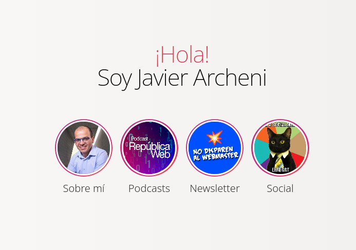
Activity 1
Starting from the following model, create your own presentation website that links to your hobbies or social networks.
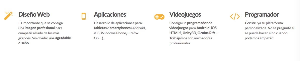
Activity 2
Starting from the following model, create a space to show what your 4 main digital skills are.
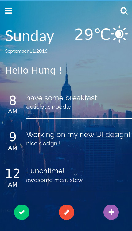
Activity 3
Starting from the following model, create your own planner that also tells you the weather.
Activity 4
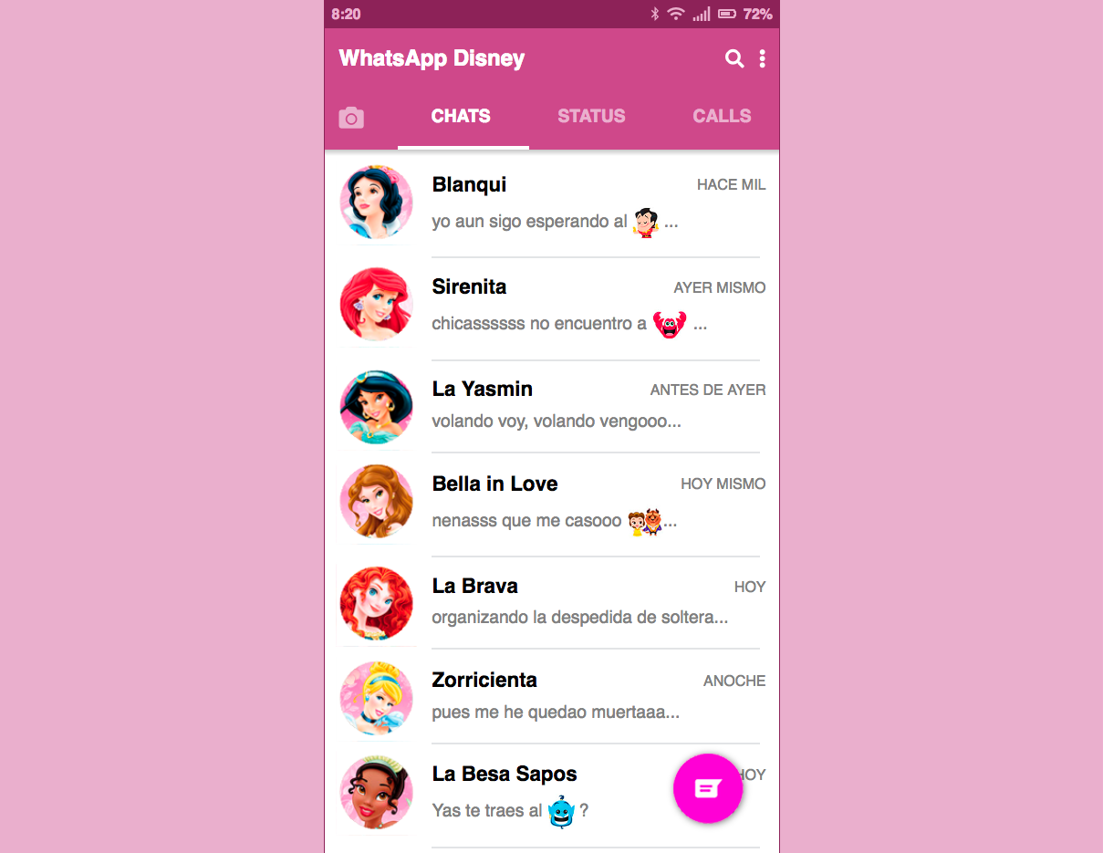
Starting from the following model, create a copy of WhatsApp.
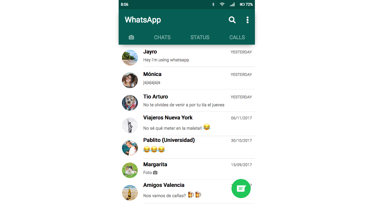
If you feel up to it, you can give it your own personality. What would the WhatsApp of the Disney princesses look like?
Activity 5
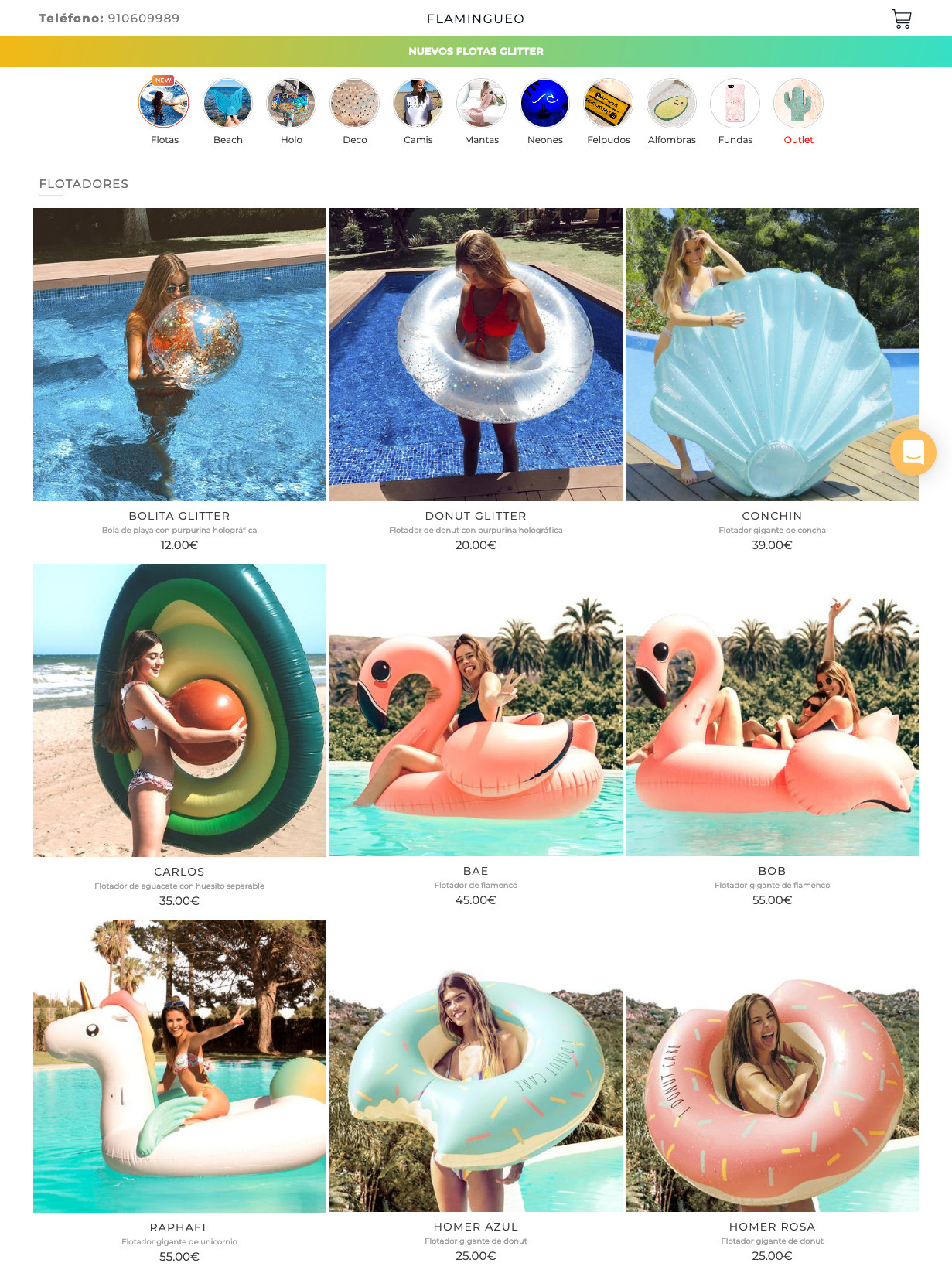
Starting from the following model, create a store selling pool floats.
:quality(85)/https://andros.dev/static/img/components/license/by-nc-nd.png)
This work is under a Attribution-NonCommercial-NoDerivatives 4.0 International license.

Building SPAs with Django and HTML Over the Wire: Learn to build real-time single page applications with Python
The HTML over WebSockets approach simplifies single-page application (SPA) development and lets you bypass learning a JavaScript rendering framework such as React, Vue, or Angular, moving the logic to Python. This web application development book provides you with all the Django tools you need to simplify your developments with real-time results.
Buy the bookHelp me keep writing
Every coffee gives me a push toward the next article.
 Sure, it's on me!
Comments
There are no comments yet.