
2. Container
A container is an element that contains other elements to limit the width of the content. Basically we will have an element that wraps all the content of the page or a particular section.
Its advantages are related to adapting a design to different resolutions. We can achieve without much effort:
- Centering the content. This can be done with
margin-inline: auto(ormargin-leftandmargin-rightwithauto). - Giving a maximum width to the design (1000px is recommended).
- Giving padding (space) around the content so that it does not stick to the edges on small screens.
Resize the following example to see how it adapts to the different screen sizes. It will take up 100% of the screen width on small screens and will lock at a fixed, centered size on large screens.
I am a container of 600px maximum, the place where the whole website will go.
To create a container, the class name .container is usually used, and the following styles are added to it.
.container {
    margin-inline: auto;
    max-width: 1000px;
    padding: 1rem;
}
The element that uses the class must always wrap all the content of the page or section.
<main>
    <div class="container">
    <!-- All the page content goes here -->
    </div>
</main>
With the previous HTML we are centering the whole page, which is not a good idea when you want to use a background color that spans the entire screen width. The ideal is to create one container for each section of the page.
.container {
    margin-inline: auto;
    max-width: 1000px;
    padding: 1rem;
}

.hero {
    background: #A9B4C2;
}

.info {
    background: #488286;
}
<main>
<section class="hero">
<div class="container">
<!-- All the section content goes here -->
</div>
</section>
<section class="info">
<div class="container">
<!-- All the section content goes here -->
</div>
</section>
</main>Sed viverra tellus in hac habitasse platea dictumst vestibulum rhoncus est pellentesque elit ullamcorper dignissim cras tincidunt lobortis feugiat? Consectetur lorem donec massa sapien, faucibus et molestie ac, feugiat sed?
Morbi tristique senectus et netus et malesuada fames ac turpis? Pellentesque nec nam aliquam sem et tortor consequat id porta nibh venenatis cras sed felis eget velit aliquet sagittis id!
As you can see, the color of the sections spans the entire width while the content is centered. We did it!
We will have the good habit of creating containers for our sections and never for the whole page. And if we need a piece of content to take up the whole screen, we simply do not wrap it in a container.
:quality(85)/https://andros.dev/static/img/components/license/by-nc-nd.png)
This work is under a Attribution-NonCommercial-NoDerivatives 4.0 International license.
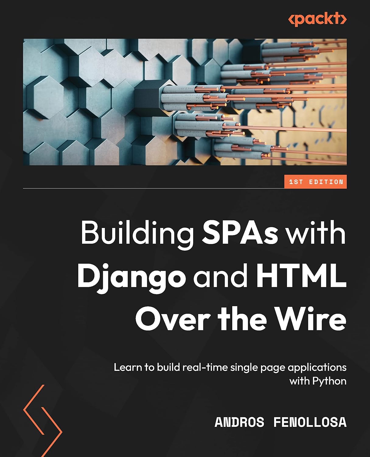
Building SPAs with Django and HTML Over the Wire: Learn to build real-time single page applications with Python
The HTML over WebSockets approach simplifies single-page application (SPA) development and lets you bypass learning a JavaScript rendering framework such as React, Vue, or Angular, moving the logic to Python. This web application development book provides you with all the Django tools you need to simplify your developments with real-time results.
Buy the bookHelp me keep writing
Every coffee gives me a push toward the next article.
 Sure, it's on me!
Comments
There are no comments yet.